
Since the previous update to the blog, I’ve completed work on a few new projects that I am now able to share. I created another Iron Man design for a client that approached me through Campbell Animation. They requested that the featured child, Albie, be the central focus of this new piece, so I removed Spider-Man completely from the design. The main challenge of the work done on this design was getting the child's skin tone correct – although he has light skin, it wasn't quite working alongside the other colours. As a consequence of this, I had to make his skin darker than I would have preferred. The finished piece can be seen featured below.

In addition to
the above, I completed another section of the Scottish design I have
discussed previously, which is roughly six main parts, of which I
have currently finished three. This will be finished in May and
hopefully soon after I will be able to show it off. I am particularly
excited about showing off this project.
To give some insight
into my process - I will occasionally do a character design between
big projects, or digitise a sketch. Below is a character design for a
fox-type character that I first sketched up a few years ago and have
now finally digitised. When I am looking for some design work to do
for fun to break my week up, I tend to look through my back catalogue
of sketches and choose one to breathe life into.
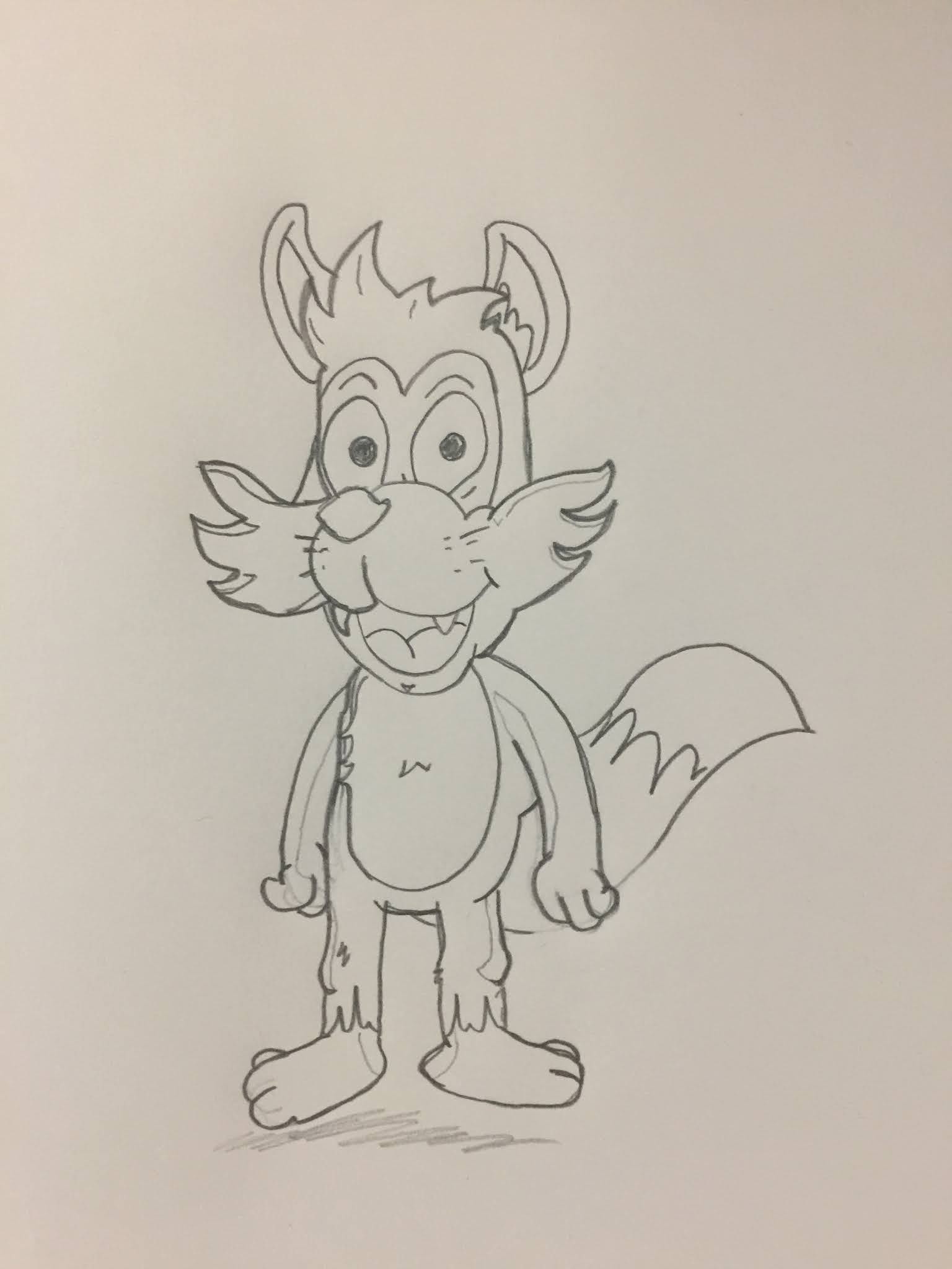

With this particular character, I imagined him as the type you'd see in a platforming video game, along the lines of Spyro or Crash. As you can see from my original sketch, it isn't perfect and required some tweaking to give the character a more natural pose in its digital form. The arms behind the head pose is my reference to Son Goku from early Dragonball – his carefree attitude is one that I believe this character would share.
I
have also done more work recently with Kenny from MoorLife, working
on the MoorBeauty brand again, building on work from a previous
design. At first we decided on a grey colour, as it had been in the
first design, but after discussing with some of his colleagues we
needed it to be female oriented (the target market) and so we made
alterations to include pink colour, eyelashes and petals on the
vines. Overall, I think this was the correct decision from their
team. In discussion with Kenny, he is going to be sending across
samples from the MoorLife clothing line, therefore I will discuss
that at a later point and do a review of these when they arrive.


Additionally, I have decided to do another
drawing challenge as I had done several years ago. I will be
designing characters based on profiles generated randomly online. I
plan to do around 31 of these (a months worth) though won't
necessarily be doing it every day. So expect many sketches to surface
on the blog too over the next few posts.
Next I intend to
continue work on the aforementioned Scottish design and I have a
Pokemon related idea that is currently in the process of printing and
will discuss further in the next post. I also have plans for a
project that will hopefully raise some funds in my local area.
More updates to come soon on this.
No comments:
Post a Comment